The New Depth In Our Interiors
Move over minimalism, wine-dark palettes are reclaiming the home with saturated hues offering a sensory sanctuary. Discover why deep tones are the ultimate tool for personal expression and mood-led interior design.
Project Melle van Sambeek Photos Bryce Carleton
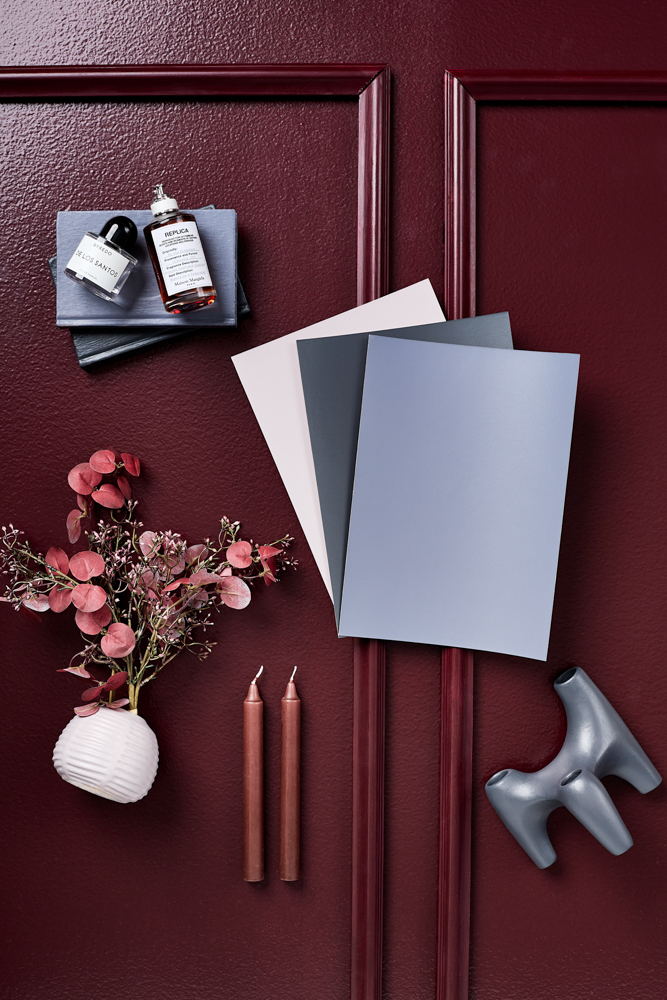
Dark interiors are shifting. Where deep colour once defaulted to charcoal or chocolate brown, a more nuanced palette is taking over, one rooted in wine-dark tones that sit somewhere between plum and brown. Shades like the masculine Resene Spitfire capture this shift perfectly, offering depth without harshness and warmth without sweetness. These colours absorb light rather than reflect it, creating interiors that feel intimate and deliberately inward-looking.
This move toward wine-dark palettes speaks to how our relationship with home has changed. Our homes are becoming far more personal in 2026 and less performative; naturally, there’s a growing appetite for spaces that feel protective rather than expressive. Bedrooms in particular are being designed for evening use – for rest, stillness and retreat – rather than daylight productivity. Wine-dark tones support this shift.
Culturally, these hues mirror broader influences from fashion/beauty. Lipstick reds, aged leather, blackened cherries and deep berry tones have replaced cool greys and stark blacks across clothing, cosmetics and furniture design. The appeal lies in their softness: these are dark colours with flesh and warmth in them. They feel rich but, more importantly, they live well, deepening in mood as light drops and softening spaces rather than flattening them.
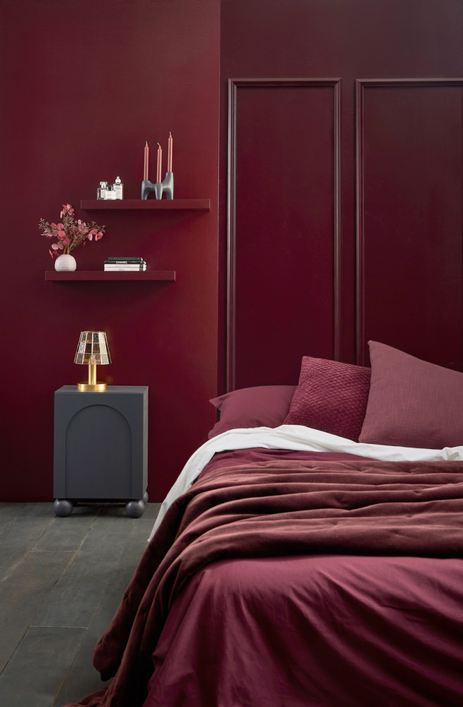
Left Wall in Resene Spitfire Lustacryl, Floor in Shade, Table in Gumboot, Shelves in Spitfire, Vases on shelves in High Tea, Candle holder in Gumboot
In this moody bedroom, walls in Resene Spitfire Lustacryl establish our cocooning mood immediately. The finish gives the colour a subtle sheen that catches low light without becoming reflective, enhancing the sense of depth. Rather than using contrast to define the space, the palette is intentionally narrow, allowing tone to do the work. Shelving in Resene Spitfire continues this immersive approach, blurring our boundary between wall and furniture and reinforcing the idea of a contained interior.
This low-contrast layering is key to the success of wine-dark schemes. Instead of breaking up the space with lighter trims or feature elements, everything sits within the same tonal family. The effect is calming, with visual interest emerging gradually through shadow, form and material rather than colour shifts. It’s a sophisticated alternative to both stark minimalism and high-contrast drama.
We introduced some architectural interest by adding a boxed wood panelling feature to the wall. Here’s our how-to:
DIY: WOOD PANELLING FOR TEXTURE AND DEPTH
- Start by purchasing timber panelling or trim lengths and cutting them to size to form rectangular or square box shapes. Arrange the pieces directly onto the wall, spacing evenly to create a tailored, structured layout.
- Fix the trim in place using construction adhesive or finishing nails, checking alignment carefully as you go.
- Once installed, paint both your panelling and the wall in the same colour (Resene Spitfire) using a semi-gloss finish. This allows the raised detailing to catch light subtly, creating shadow and dimension without breaking the tonal flow of the room.
The effect is texture without contrast: a refined way to add visual interest while reinforcing the wine-dark palette and the sense of enclosure that defines this trend.
What really distinguishes this look from earlier dark interior trends is its emotional intention; this isn’t about drama or maximalism for its own sake. Wine-dark palettes reflect a broader desire for rooms that feel protective and quietly luxurious. They respond to fatigue with over-lit, over-styled interiors and acknowledge that not every space needs to perform for daylight or social media. Some rooms exist to be used in the quiet hours, and this palette is designed for that.
Hints & Tricks
Small Matters
Furniture and smaller architectural elements introduce subtle variation without disrupting our overall mood. A side table in Resene Gumboot adds a brown-black undertone that grounds the palette, offering a gentle contrast to the red depth of the walls. The same shade on a candle holder reinforces continuity. This really shows how repetition (rather than variety) is what makes dark schemes feel intentional rather than heavy.
Anchor the Space
Underfoot, nearly black, but with warmth, the floor in Resene Shade anchors the space. It grounds the room visually and supports our cocooning effect established by the Resene Spitfire walls. Dark floors are essential in wine-dark interiors, preventing the eye from dropping abruptly into a lighter base and maintaining the sense of enclosure that makes these palettes so soothing.
Texture is Crucial
When you’re working within a tight colour range, fabric/furniture variation becomes essential. Soft textiles and subtle architectural detailing ensure the space feels layered rather than flat. This is where our simple paint-based DIY projects can add depth without introducing new colours.