My colourful world … with Ness Dickie
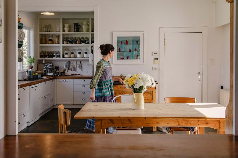
Farmers, product designers and entrepreneurs Ben and Ness Dickie were a natural choice for our cover story this issue with their beautiful home and property in Waverley, Whanganui creating an enviable lifestyle. Here Ness shares an insight into her journey and love of colour.
How would you describe your relationship with colour?
I love colours and I love how they can affect your mood. Like when you’re feeling happy and confident you might wear something bright and bold as opposed to if you’re feeling tired you might choose a darker colour to blend into the background.
What inspires your use of colour?
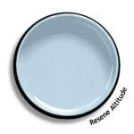
Nature. I love the colours and shade variations that you see when you look around. My favourite colours are the sky blues like Resene Altitude; Resene Green Leaf and its spring leaf vibe, and Resene Amour which reminds me of cherry blossom.
Your home is filled with beautiful, colourful artworks – what draws you to a piece of art?
How it makes me feel. Art makes you feel something. Some spaces call for soothing, peaceful pieces and other areas carry art with a more thought-provoking, fun or interesting feeling. We are extremely lucky in Whanganui as there are so many talented artists who live here so there is always something new to discover.
Do you have any favourite colours that you incorporate into your home?
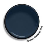
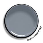
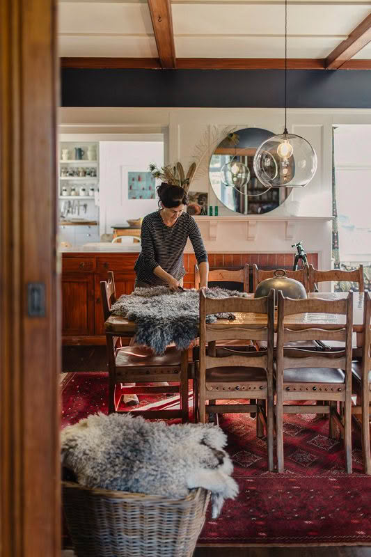
Blues and greens. Actually quite a bit of blue – we painted our dining room Resene Shadowy Blue – a dark navy to create a dark, warm, cosy atmosphere, and our guest bedroom Resene Neutral Bay for a peaceful, relaxing vibe. I love the calming effect of how blues complement the heart rimu trimmings in the house.
When restoring a home and cottage of this age, what role did colour play?
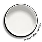
We really wanted to paint the interiors a warm white to add lightness but not feel cold. Believe it or not, we painted our lounge three times until we found the right white for us, settling on Resene Eighth Rice Cake. We’ve used more neutral muted colours to create a warm, cosy feeling as we felt bright modern colours wouldn’t match the feel of an older home.
As a product designer, how does colour come into play with planning, executing and creating a brand?
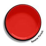
It’s really important. Colours make people feel things and can bring a product personality to life. So you really need to think about how you want people to feel. For our That’s It branding we’ve gone with bright bold colours like Resene Hashtag, Resene Pursuit and Resene Morning Glory to express the brand’s fun, cheeky, upfront attitude. For Three Sticks the colour palette is more neutral, natural shades like that of Resene Half Sea Fog to express the calming, luxurious feel of the brand.
