My colourful world
Wellington commercial product and food producer Nikki Astwood takes us behind the scenes of her bold and intricately crafted still lifes.

Tell us a bit about you.
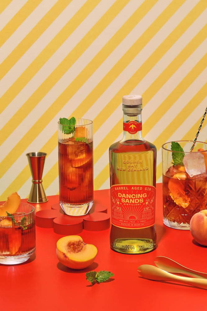
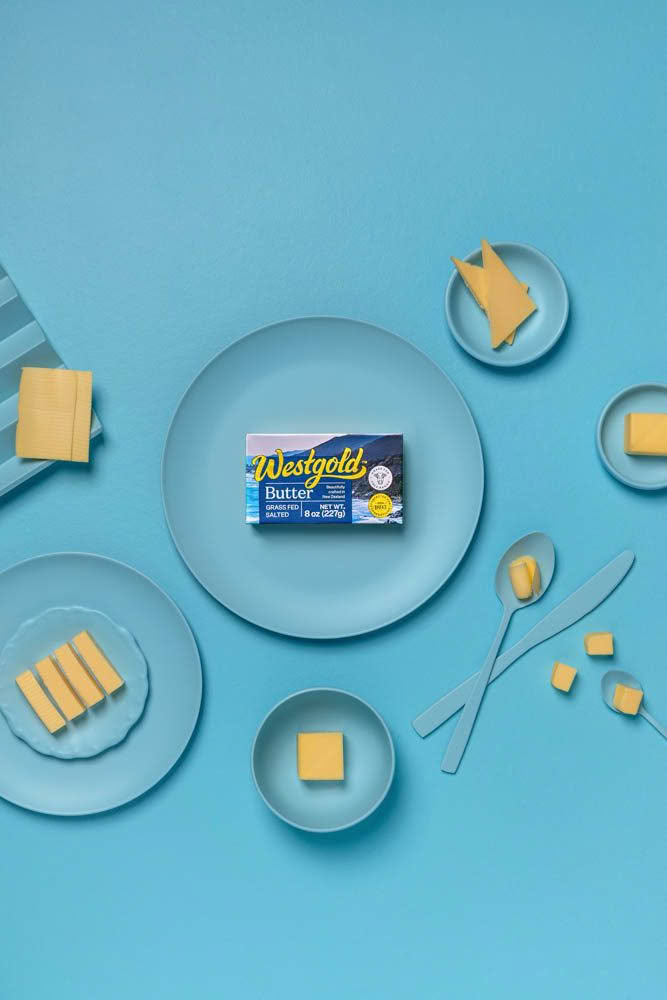
Essentially I work with brands to produce still life images that are used to promote their products. I create scenes (some simple, some much more elaborate) that help the product to stand out and create a story, or message, that ties back to the brand. Typically with Resene paint as the backdrop.
My background is in food and beverage so it made sense to have that as a focus, and use that knowledge to create delicious food scenes. I also love the opportunity to be able to cook for some shoots or make cocktails as it really means I am creating everything myself.
Over the years my photography style has always been dominated by colour and paint.
Have you always worked with colour?
Colour has been a major part of work. I started out revamping old furniture and giving it a new look with lots of colour and pattern. Resene paint colours were my main inspiration for these projects. It was definitely ‘the brighter the better’ in those days! When the furniture was complete, I would style and photograph it to sell; this was my favourite part of the process and I worked out from this that it wasn’t the furniture I was so excited about but the styling and photography.
Colour and paint continue to be one of my main sources of inspiration today and when receiving a client brief, finding out the colour palette I will be working with is still my favourite part.
How does colour inform or inspire you?
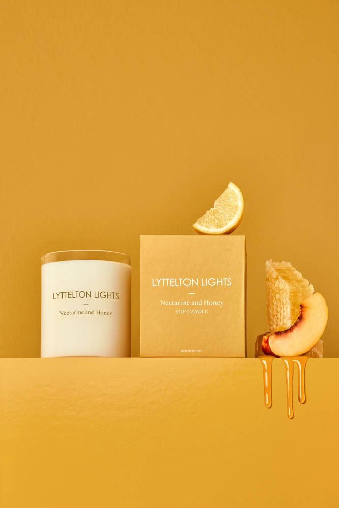
All it takes for me is to see a single colour or a combination of colours that I like and my mind will start ticking over, thinking about how I could use that in a photo. Generally, I use colour to convey a mood or a message. Product and food photography is so much about being able to tell a story and colour is a huge part of being able to get that right.
In my own personal work I like to take the time to try different unexpected colours and combinations.

How important is colour when it comes to branding?
So important. It tells people if your brand is fun and quirky or more serious and thoughtful for example. It grabs your audience’s attention and draws them to find out more about you.
What are your favourite colours to work with?
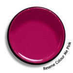
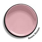
Pink is my all-time favourite – it can be bright and bold like Resene Colour Me Pink or soft and muted like Resene Blossom. I love it in all its forms! I am not sure what it is about it but I am just naturally always drawn to the opportunity to work with pink. I can really make a pink work in almost any colour palette.
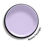
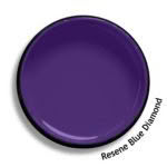
I also love purple from the lighter muted tones such as Resene Fairylight to the darker and moodier of Resene Blue Diamond. I always tend to lean more towards bright and bold colours but do like to incorporate some pastels in there as well to keep things balanced.
One of my favourite combinations is pink and red although I don’t really work with loads of red. Put it with some pink and that is a completely different story.
