My Colourful World … with Klaudia
Our art director Klaudia Krupa is in the hot seat this issue as we dive into her creative world and the role colour plays in her day-to-day.
Tell us a bit about you.
I’m the art director here at CountryWide, which means I get to spend my days creating beautiful magazine layouts and ensuring every design visually tells a story.
Creativity is a huge part of my life, both at work and outside of it. My husband and I live on a lifestyle property in Canterbury, where over the past few years we’ve been gradually renovating our home and planting out the garden from scratch. I’ve loved every aspect of the journey – from designing a new kitchen to selecting and laying flooring, and everything in between. DIY projects are a big part of my life, both inside the home and in the garden. There’s nothing quite like the satisfaction of building something yourself or harvesting home-grown food.
What role does colour play in your day-to-day?
Colour is everything, it sets the mood and brings balance to any space or design. Whether it’s the cover of a magazine or a painted fence, colour has a way of making everything feel purposeful. It ties everything together, creating a space or design that feels complete and full of life.
What informs your choice of colour in design, and how do you find palettes and combinations that work?
For me, choosing colours is a mix of intuition and research, with nature being my biggest inspiration. It has a remarkable way of pairing complementary tones effortlessly – whether it’s the soft greens and earthy browns of a landscape, the vibrant contrasts of flowers in bloom, or the rich, layered hues of a sunset.
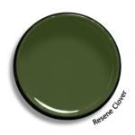
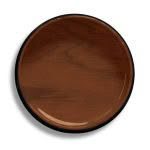
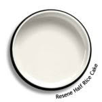
For home projects, I often turn to the Resene website for ideas for textures, effects and of course colour. Our walls are painted Resene Half Rice Cake, a shade that feels fresh and timeless. In the garden, I’ve embraced neutral, nature-inspired tones like Resene Kwila Timber Stain and Resene Clover.
For magazine design, it starts with the tone of the story, whether it’s playful, calming, or sophisticated, and builds from there. The goal is always balance and creating a sense of harmony that feels thoughtful and visually engaging. The Resene Colour Palette Generator, resene.com/palettegenerator, is a great resource when it comes to selecting colours that work well together to help achieve this.
What colour trends do you predict we will see in 2025?
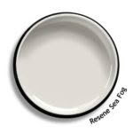
I think we’ll see a palette of warm, earthy tones. Think vibrant burgundies, rich browns, and olive greens, bringing a sense of comfort to spaces. My next project is a bathroom renovation where these tones will be perfect. I’m considering a colourwash effect with Resene FX Paint Effects Medium and Resene Triple Sea Fog, paired with warm natural materials to create a serene, organic space.
Where can readers find you when not at your desk?
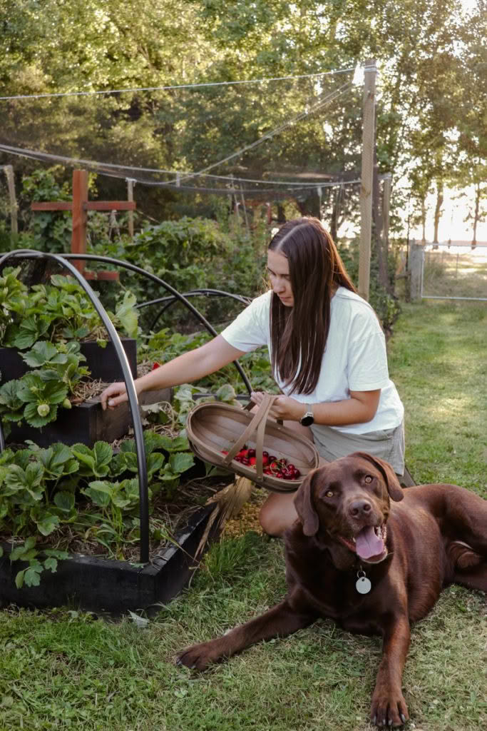
You’ll definitely find me in the garden, with Walter the chocolate Labrador by my side! When we first moved to the property, it
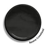
was just empty paddocks, but now it’s brimming with fruit trees, berries and vegetables. I’ve built everything from boot racks to planters, and the bar, dartboard cabinet, and cornhole set were big hits over the summer. I’ve also been busy with painting projects, like giving the fence a fresh coat of Resene Crowshead stain to match the strawberry tower and clothesline.
And when I’m not working on a new project (or trying to win the never-ending battle with weeds!), you’ll probably find me relaxing in the hammock with a good book.
